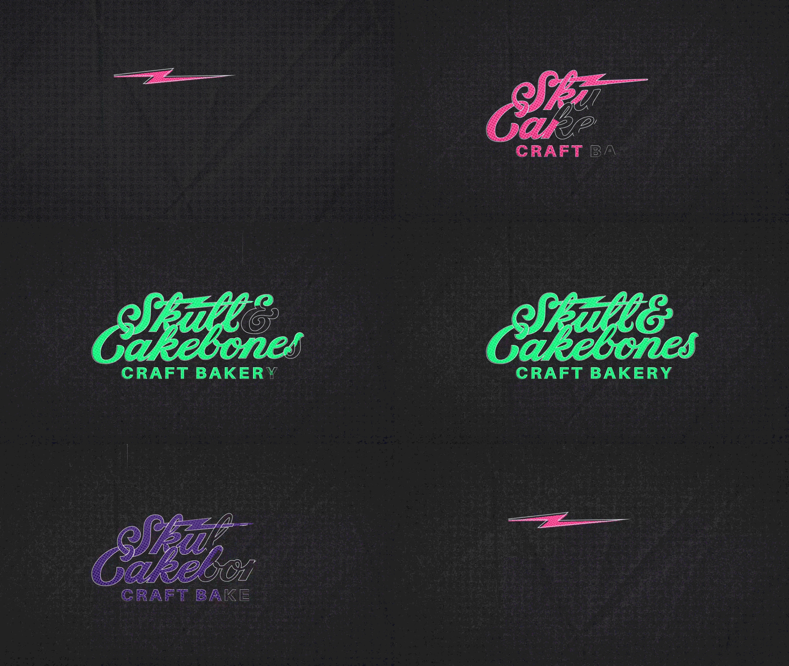
Skull & Cakebones
Objective
Produce a 30-second motion graphics-based promotion for Austin-area plant-based bakery and market, Skull & Cakebones. Bring existing branding alive through animation, highlighting the production of local and natural foods available at multiple locations around Austin, including a dedicated brick-and-mortar location in Dripping Springs.
The Team: Kat McRaven Davis (Design Lead, Illustration, Animation), Emily Seabroke (aka Tashi Delay: Music, VO, Animation), Cesar Rodriguez (3D, Animation)
Concept
Our crew of three designers was asked to create the promotion from scratch, including everything from overall concept, script, VO, music, through execution of the final design. From the start we knew we wanted to highlight the ingredients of the food, showing fruits and vegetables, but we needed a compelling voiceover to provide context. Our first script was short, with a plan to put more emphasis on the food through visuals, but after putting together a rough animatic, the pace was too slow. The updated final script engages the viewer and provides more information about Skull & Cakebones products.
Selected moodboard imagery
Early Concept Sketches
Skull & Cakebones Brand Guidelines by Zachary Horst
Design
Design cues came from Skull & Cakebones’ established branding, made by Zachary Horst. We loved the tattoo-inspired style and launched from that central style into related concepts, from vintage arcades and roller rinks to horror movies.
Ultimately, our best inspiration came from the side exterior wall of the Dripping Springs bakery and market, which has murals of stylized vegetables and simple shapes with text. What if we could take that mural and bring it to life, putting the physical location front and center in our ad? The geometric shapes of the mural, and dotted brand elements brought us to explore pop art. We still wanted to keep the edgy-yet-inclusive style in mind, so we kept in the back of our minds a little uncanny movement and darker inspiration, but with a cheery and welcoming limited color palette.
As Design lead, I was responsible for ensuring a consistent, cohesive look, from colors and brand adherence to illustration styles and consistent motion. I created style guides to help the team and, after some illustration style tests and working with Emily and Cesar, extensive style boards to guide us in the final animation.
Although deceptively simple in style, each illustrated element with its animated half-tone dots required testing for cohesive movement and style. One of the greatest challenges was bringing together 3D and 2D elements in the same world: our plan for rotating vegetables ‘exploding’ into a sandwich as well as the pouring pitcher required 3D modeling. Much of my work as design lead was deciding which elements should be 3D (such as the 2D vs. 3D skull tests I created here, and the pouring pitcher, which I modeled, animated, and styled), which should be 2D, and how to make those elements match (see the animation test for the tomato, which I styled over Cesar’s animated model of a tomato).
Final Execution
With style established, the team split foreground sections amongst ourselves to animate, with regular meetings to review updated renders and check for consistency. Each team member was primarily responsible for animating different sections of the final product; my animation work primarily focused around the mural, falling vegetable and pitcher sequence, and logo reveal. After rounds of joint feedback and edits, the final promotion for Skull & Cakebones came together as the culmination of a weeks-long joint effort.


